UX Design
Mobile Application
Background
Goal.
Designing a mobile loyalty application for an arcade that allows users to keep track of rewards, points, and high scores while on the go at an arcade, making it a fun and exciting way to save many and earn prizes.
Audience.
The intended audience for this app is individuals in their teens to late thirties who enjoy a variety of solo or group activities such as mini-golf, bowling, or video games.
Key Challenges.
The biggest challenges were designing an app that included a straightforward process for playing, earning points, and redeeming rewards that could be understood and followed by a wide age range. Another challenge was designing a system that would allow app users to earn exclusive rewards through unique opportunities.
Research
I interviewed 5 people in order to get a better sense of what possible users for this app might need or be like. Then, I created a visual of themes and ideas that were repeated in the interviews. Given the range of suggestions and nice-to-haves, I decided to focus on three main items.
Redeeming rewards.
A recurring theme was the opportunity to view the rewards they were able to claim within the app instead of having to go in person and figure out what was available to redeem. Users also wanted these rewards to be worthwhile and redeemable through the app.
Keeping track of points.
Users were also highly interested in being able to store their earned points or “tickets” within the app instead of having to carry physical tickets as traditionally done at old-school arcade establishments. They wanted to make sure they could save them up and redeem a bigger prize later.
Payment methods.
Users also wanted the convenience of being able to reload their game cards within the app if needed, instead of having to go to a kiosk once they got there and possibly having to wait for others to reload cards or get coins for their games. A key part of this experience is the digital experience, so QR codes were also integrated into the user journey.
User Personas
Based on interviews done for 5 different people, I created the following two personas to represent the typical user of this application.
Meet Stephen.
Stephen is a busy professional who needs an easy way to keep track of high scores, rewards, and tickets because he wants to have fun while also saving money.
Meet Samantha.
Samantha is a graduate student who needs a way to coordinate arcade outings with friends because it’s hard to keep track of her friend’s schedules.
User Journey Map
In order to understand Stephen and Samantha’s needs, I created user journey maps to outline their tasks, feelings, and improvement opportunities for their experiences.
Competitive Audit
To understand the current market and gaps for a product like this, I conducted a competitive audit of four companies including Dave & Buster’s (direct competitor), Bowlero (indirect competitor), and Chuck E. Cheese (indirect competitor).
Dave & Buster’s is a direct competitor with a nationwide presence that offers a classic arcade, VR experiences, video games, food, drinks, and event spaces for special occasions. At a medium price range, this business appeals to young adults.
Bowlero is an indirect competitor with a nationwide presence that focuses on bowling experiences, offers some classic arcade games, food, and drinks. At a medium price range, this business appeals to families and adults.
Finally, Chuck E. Cheese is an indirect competitor whose target audience is families and young kids and is on the lower end of the price spectrum. This business offers kid-friendly games, food, and drinks.
To address gaps in the market, I identified a few things that my product could offer, including:
Personalized game recommendations and challenges based on user profiles created during set-up
Ability to order food in-app, and have drinks or food brought to your table/game directly.
List of games and skill/level requirements to indicate the level of physicality required and whether it is appropriate for certain people or ages.
Design Process
For this project, I decided to focus on Stephen’s needs as a user: a mobile application that makes it easy to keep track of high scores, rewards, and tickets.
Wireframes
After creating storyboards of what a user’s experience of the app might be, I created paper wireframes to capture a general sense of what the main screens of the app could look like. After capturing some of the main screens in the user journey, I moved the paper wireframes to Figma to play around with more design elements and possibilities. Below is the final iteration of the app’s digital wireframes.
Digital wireframes in Figma.
Low Fidelity Prototypes
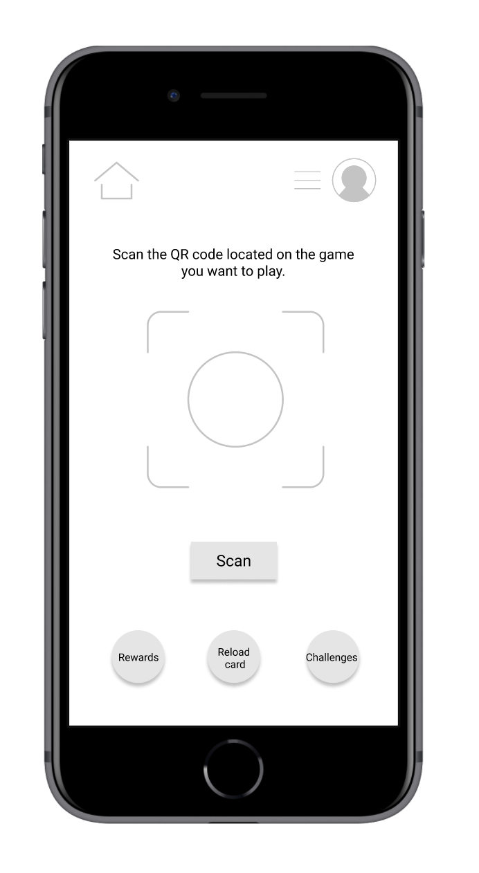
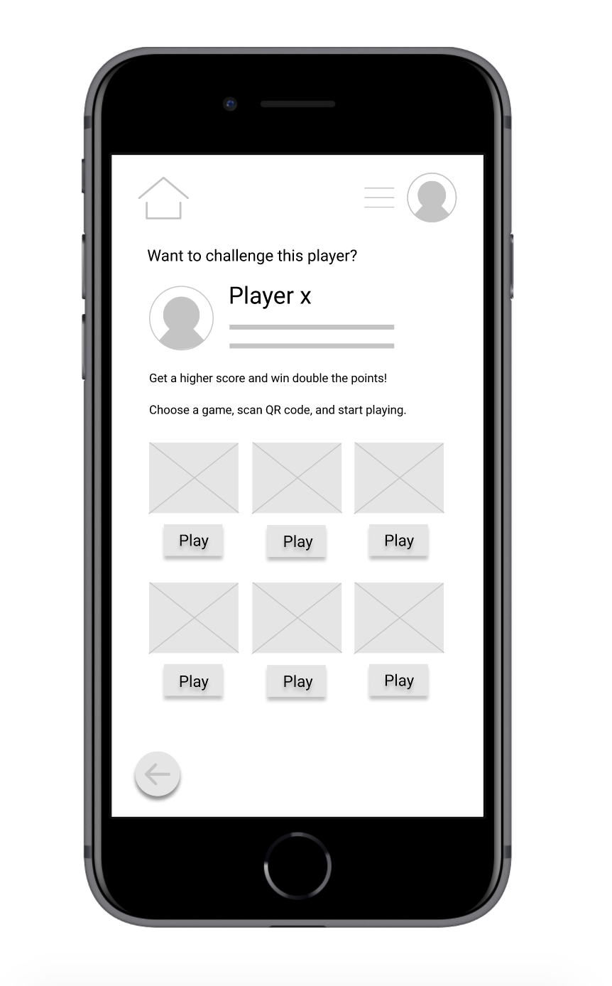
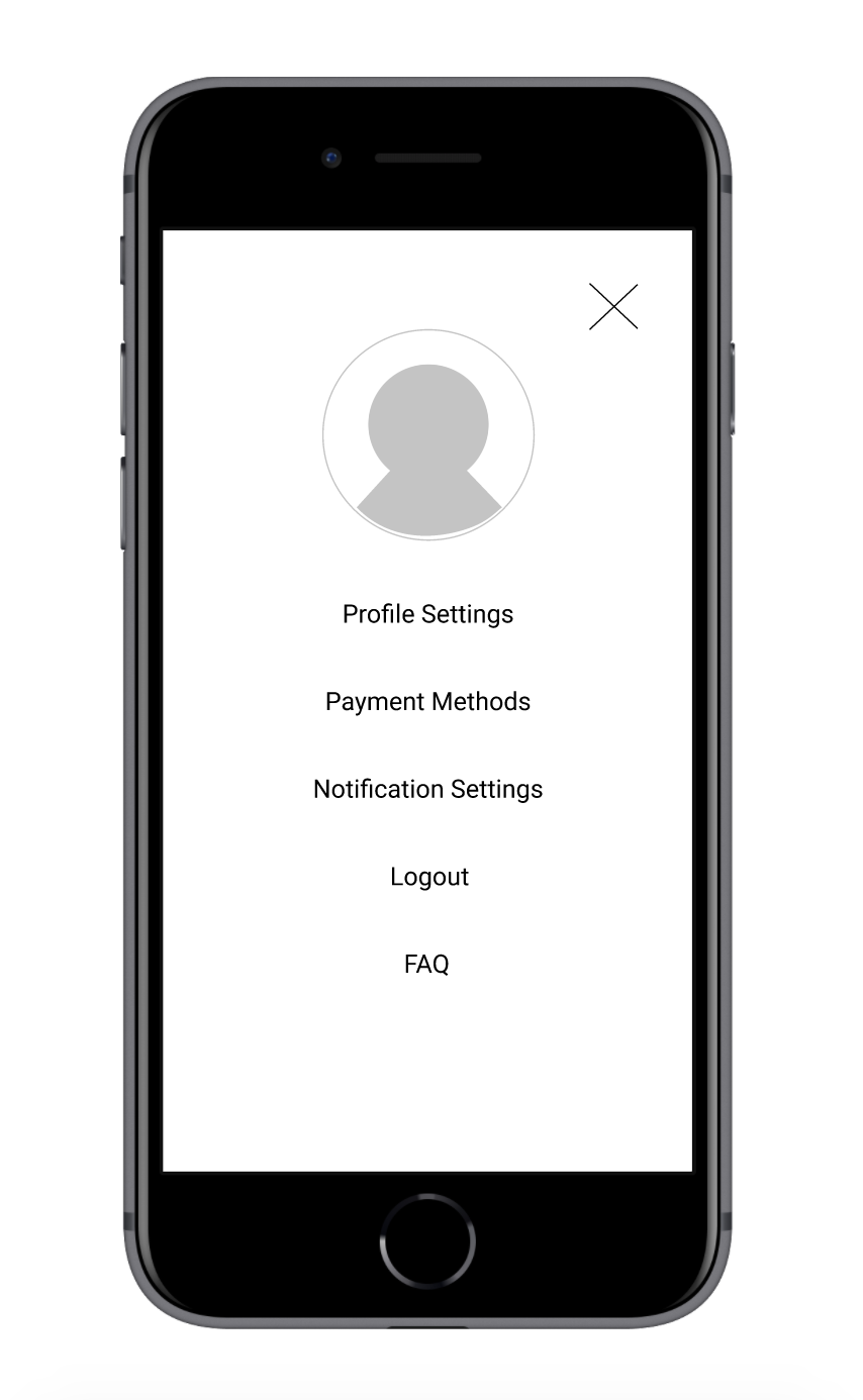
After creating digital wireframes in Figma and finalizing the ideal user journey and their needs within the app, I moved on to creating low fidelity prototypes of the main user journey screens. The lo-fi prototype captured a home screen, a challenges page, an individual challenge and challenge player screen, a QR code screen, a rewards screen, and a screen for reloading game card balances.




Usability Testing
It was now time to move on to testing the low-fidelity prototypes with a few key questions in mind for participants to answer. We need to find out if the main user experience, collecting points and redeeming rewards is easy and straightforward for users to complete. We’d also like to understand if there are any hurdles or specific challenges that the user faces in order for us to address them.
How long does it take the user to scan and collect points, and redeem rewards?
Are there parts of the user flow where the user gets stuck?
Are there features in the app that are unnecessary or that are missing?
Do users think the app is easy or difficult to use?
User Insights
The user testing of the app’s low-fidelity prototype provided some valuable insights on user challenges that needed to be addressed in the next iteration of the design.
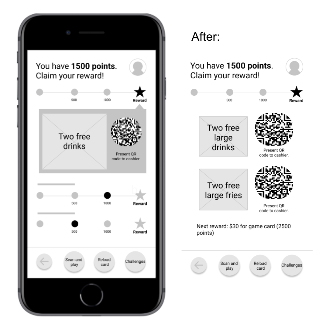
The rewards screen is not clear. Most users were slightly confused by some items on the rewards screen.
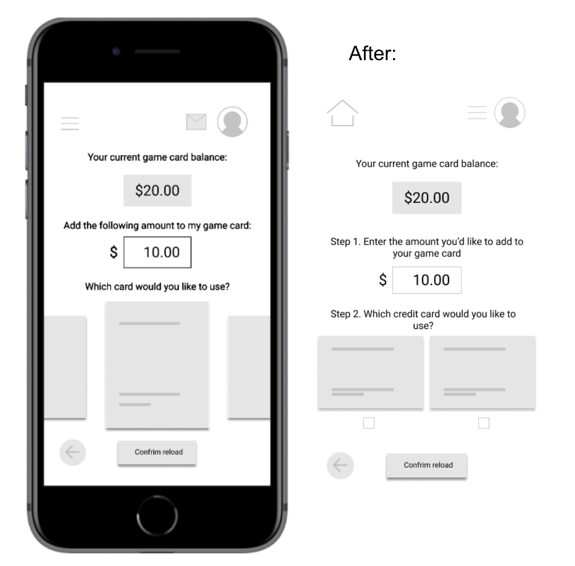
Reloading cards can be confusing. Users might need more functionality added to the reload card screen, such as credit card and game card options.
The Challenge feature needs better instructions. Most users were unclear on the process of completing a challenge or the value of challenging players.
Scanning QR codes also needs better instructions. Better instructions for scanning QR codes can benefit all users.
Improvements
To address the confusion on some screens, I made the following addition or changes to the low fidelity prototypes.
Add clearer instructions for challenging players by making the scan feature more prominent, and explaining the value of challenging others (i.e. double the points eligible for top player rewards, etc.)
Add an option for players to view game cards and/or credit cards on the reload card screen–giving them more reload options.
Provide guidance for rewards screen and scanning QR codes in-app.

High Fidelity Prototypes
After implementing the improvements that were identified after the usability tests for the app’s low-fidelity prototypes, I moved on to creating high-fidelity prototypes in Figma, including the branding elements that would distinguish the app from other competitors in the same market.
Branding
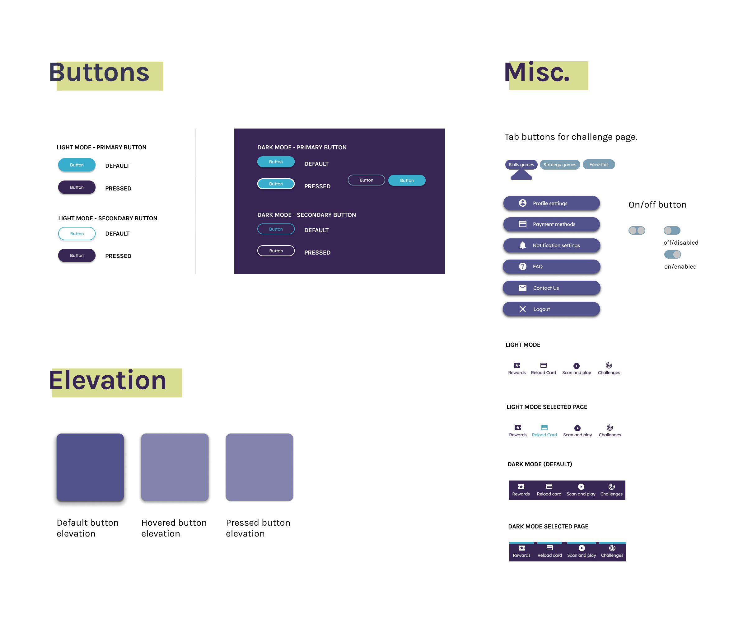
The inspiration for Pixelworld’s online brand came from the dark and neon ambiance of arcades. For this reason, the app’s default design was a dark mode with deep purple colors and bright, attention-grabbing accent colors for CTAs.


Usability Testing
After the app’s branding was finalized, It was now time to move on to testing the high-fidelity prototypes with a few key questions in mind for participants to answer. Similar to the low-fidelity prototypes, we needed to find out if the main user experience, collecting points and redeeming rewards is easy and straightforward for users to complete. We’d also like to understand if there are any hurdles or specific challenges that the user faces in order for us to address them. This meant that I asked the same questions as before:
How long does it take the user to scan and collect points, and redeem rewards?
Are there parts of the user flow where the user gets stuck?
Are there features in the app that are unnecessary or that are missing?
Do users think the app is easy or difficult to use?
After conducting a usability test on the high-fidelity prototypes, here’s what I found.
User Insights
Based on the theme that most users felt confused about the rewards redemption process, an insight is: using more clear language in CTAs and content on the rewards-related screens.
Based on the theme that most participants had trouble clicking on the bottom navigation buttons, an insight is: fix the bottom navigation bar’s functionality in the prototype to avoid frustration.
Based on the theme that some users were confused about the process of challenging a player, an insight is: adding clearer instructions on what to do at this step or linking the FAQ section.


Final Design
After finalizing the improvements that were identified in the usability tests for the high-fidelity prototype, the final iteration of the design was finalized. This design will make arcade experiences an even more collaborative and rewarding experience, especially for arcade enthusiasts. Most importantly, the design was considered simple, straightforward, and visually appealing to all study participants.
Accessibility Considerations
FAQ. For users with less technology experience, I created a simple FAQ section intended to explain certain things in the user journey.
Colors/Motion. The color palettes of the branding guidelines were checked for accessible color contrast, and an option to disable motion was added to the main settings menu.
Icons/Imagery. Icons were paired with text descriptors to ensure users had a visual and textual representation of what they were clicking on. Other imagery included alt text descriptions.

Next steps
Conduct a final round of usability testing on the updated high-fidelity prototype (including all supporting screens).
Ensure that QR code scanning functionality works between arcade games and the mobile application.
Design light mode version of the app using the established design system to ensure accessible options for visually impaired users.
Let’s connect!
To get in touch and learn more about Pixelworld’s mobile application, feel free to connect with me on LinkedIn.


